Why does a paint swatch that looks perfect in the store often turn into a neon nightmare once it hits your living room wall? Learning how to choose interior paint colors in New Mexico requires more than just picking a pretty shade from a fan deck. It's a common frustration to see a beautiful neutral suddenly look "too blue" or "too yellow" because of our intense, high-altitude sun. You want a home that feels cohesive, not a collection of rooms that clash with your existing woodwork and tile.
It's understandable to feel stuck when trying to match new shades with traditional elements like dark wood vigas or saltillo tile. This guide will help you master the art of selection by understanding local lighting and professional testing methods. We'll cover the impact of UV exposure, explain how different finishes change the final result, and look at the warm, earthy trends currently shaping the Southwest. You'll gain the confidence to build a professional palette that honors your home's architecture while reflecting your personal style.
Key Takeaways
- Learn how Light Reflectance Value (LRV) and New Mexico’s intense high-altitude sun change how paint looks on your walls throughout the day.
- Discover a practical framework for how to choose interior paint colors that complement your home’s existing wood beams, tile, and cabinetry.
- Understand why popular cool grays often turn into unappealing "cold blues" in the unique light of Albuquerque and Rio Rancho.
- Master professional testing methods like the "White Border" technique to ensure your chosen shade looks exactly as intended before the first brushstroke.
- See how professional prep work and high-quality primer eliminate shadows and ensure true color saturation for a lasting finish.
Understanding the Impact of Lighting and Room Function
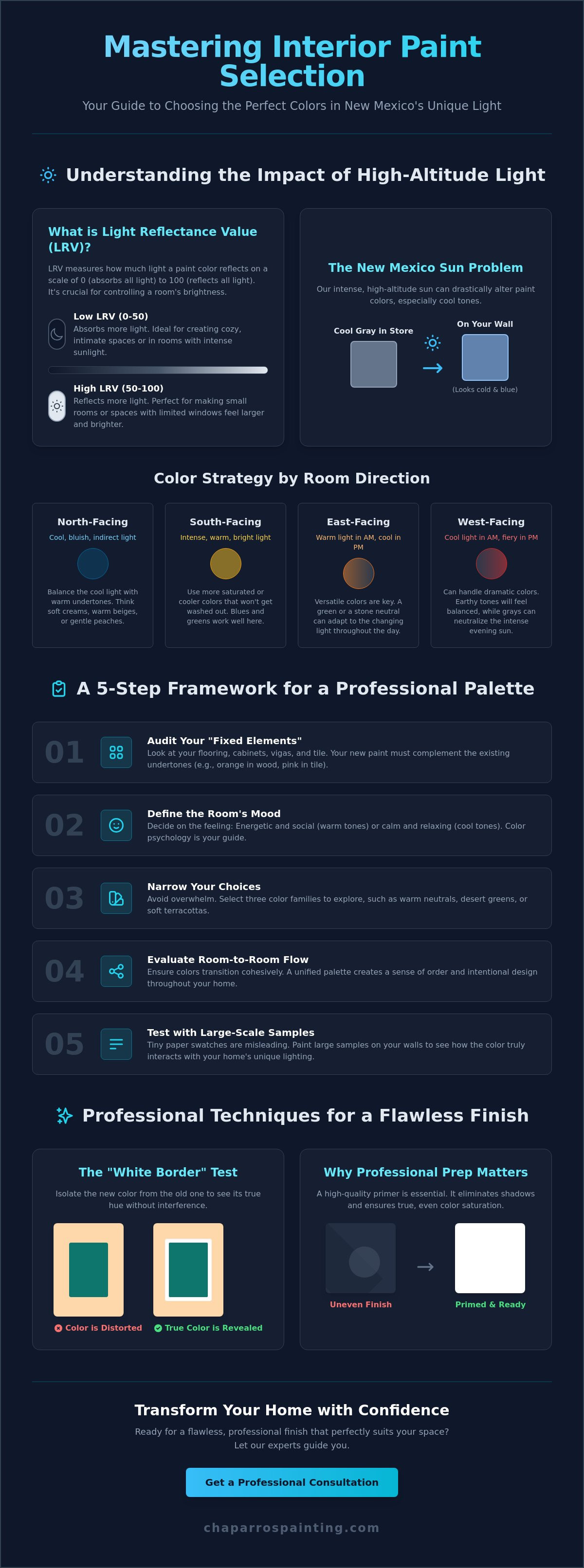
Lighting isn't just an aesthetic detail; it's a technical requirement that dictates how a room feels. When you are learning how to choose interior paint colors, you have to start with the physics of your specific space. Every paint color has a Light Reflectance Value (LRV) measured on a scale from 0 to 100. This number tells you how much light the paint reflects back into the room. A high LRV reflects most light, while a low LRV absorbs it. If you're painting a small room with limited windows, choosing a high LRV is essential to prevent the space from feeling cramped or dark.
The appearance of your walls will shift from morning to evening. A soft tan might look crisp at 8:00 AM but turn muddy as the sun sets. This happens because the angle and temperature of natural light change throughout the day. You also need to consider the room's purpose. A home office needs cooler, crisp tones to help you focus, while a bedroom benefits from warmer, darker shades that promote relaxation.
Natural Light: North vs. South Facing Rooms
The direction your windows face is the biggest factor in color distortion. North-facing rooms receive cool, bluish light all day. If you use a cool gray or a pale blue here, the room will feel chilly and sterile. You'll want to choose colors with warm undertones like creams or soft peaches to balance that blue light. South-facing rooms in New Mexico get blasted with intense, warm sunlight. This light is so strong it can wash out pale colors entirely. In these rooms, you can afford to use more saturated tones or cooler shades to counteract the heat of the sun.
East-facing rooms get bright, warm light in the morning and turn gray in the afternoon. West-facing rooms are the opposite; they feel dull early on but get hit with a fiery, high-contrast glow in the evening. Understanding these shifts is a core part of how to choose interior paint colors that remain attractive at all hours.
The Psychology of Color in Residential Spaces
A solid grasp of Color theory helps you align your paint choices with the mood of each room. Cool tones like sage greens and soft blues are proven to lower the heart rate. They are perfect for bathrooms and bedrooms where rest is the priority. Warm neutrals and earthy tones encourage socialization and comfort. These are the best choices for living areas and kitchens where people gather. You can use bold accent colors for personality, but keep them limited to one wall or a specific architectural feature to avoid overwhelming the space.
Finally, consider your artificial lighting. Standard incandescent bulbs add a yellow, warm glow to everything. Modern LEDs come in different color temperatures measured in Kelvins. A "daylight" LED bulb (5000K) mimics the sun but can make warm colors look harsh. Always test your paint samples under the exact bulbs you plan to use at night.
A 5-Step Framework for Selecting Your Interior Palette
Picking the right palette doesn't have to be overwhelming. Most homeowners get stuck because they look at thousands of options at once. To simplify how to choose interior paint colors, you need a disciplined framework that moves from the structural elements of your home to the final aesthetic details. Follow this five-step process to ensure a professional result.
- Step 1: Audit your "fixed elements." Look at your flooring, cabinetry, and stone features. These aren't changing, so your paint must work with them.
- Step 2: Define the mood. Decide if the room should feel energetic or calm. Relying on scientific research into color psychology can help you understand how specific hues impact your daily stress levels and focus.
- Step 3: Narrow your choices. Select three specific color families, such as warm neutrals, desert greens, or soft terracottas.
- Step 4: Evaluate the connection. Look at how colors transition from one room to the next. This is vital for maintaining a sense of order.
- Step 5: Move to large-scale samples. Tiny paper chips are misleading. Use large physical samples to see how the pigment reacts to your specific walls.
Working with Your Existing Home Features
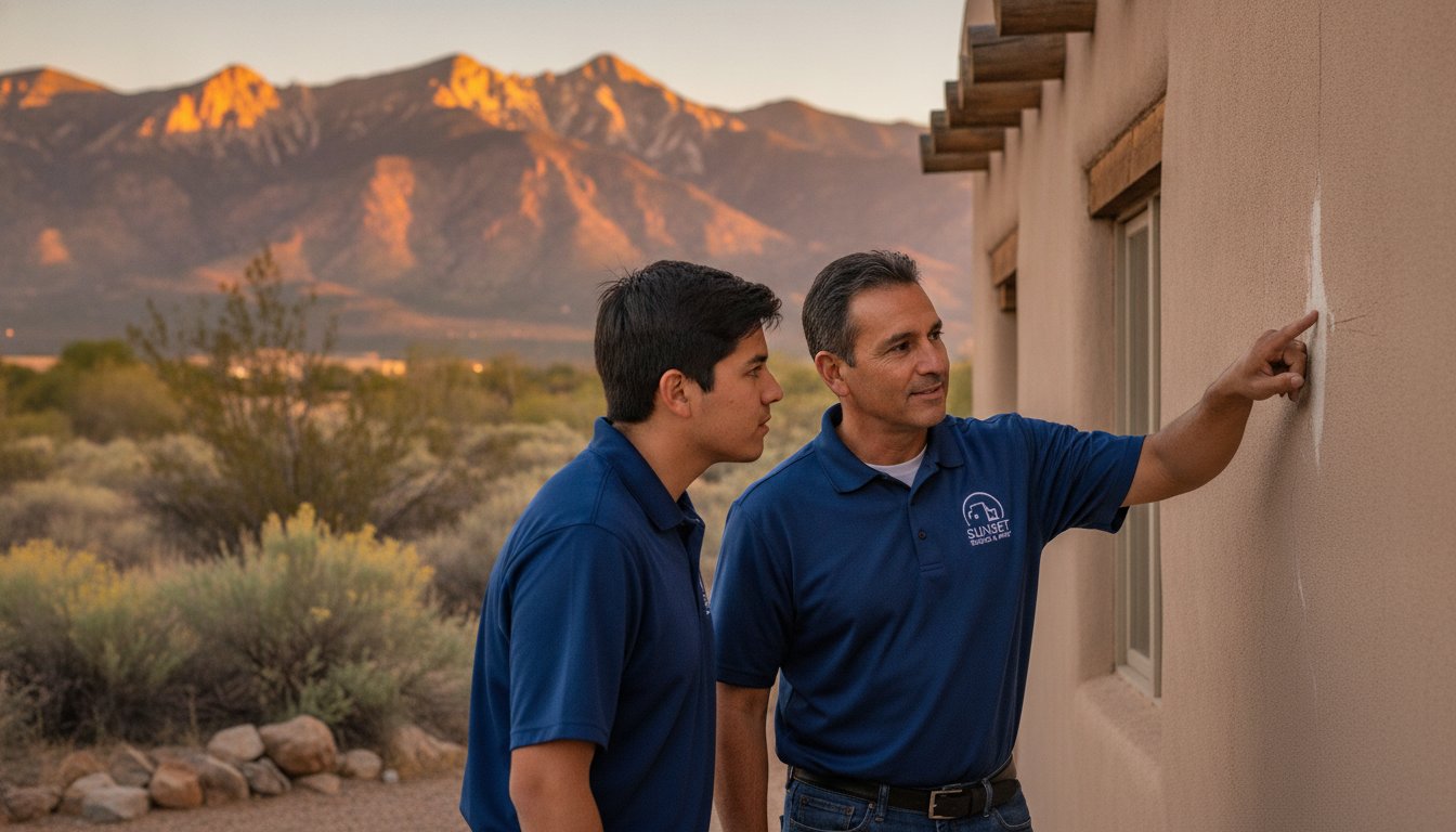
Your "fixed elements" have hidden undertones that dictate your color success. Hardwood floors often lean orange or red, while tile might have pink or green bases. If you choose a wall color that clashes with these undertones, the whole room will feel "off." Your furniture should also influence your choice. It's much easier to match paint to a sofa you already own than to find a sofa that matches a specific paint shade. If you're struggling to identify these subtle tones, a professional interior painting expert can help you see what the untrained eye might miss.
Creating a Cohesive Whole-House Color Scheme
Balance is the key to a professional look. Designers often use the 60-30-10 rule to organize a space. This means 60% of the room is a dominant color, 30% is a secondary color, and 10% is a bold accent. In New Mexico's open-concept homes, this prevents the space from looking chaotic. You can also use varying shades of the same hue to create a sophisticated, monochromatic look. This adds depth without the risk of clashing. Smooth transitions between the kitchen, dining, and living areas keep the home feeling like a single, well-planned environment rather than a series of disconnected boxes.
Choosing Colors for New Mexico’s Unique High Desert Environment
New Mexico isn't like the Midwest or the Coast. Geography dictates your design choices here. At an elevation of over 5,000 feet in Rio Rancho, the atmosphere is thinner and the sunlight is significantly more intense. This "crisp" light affects how to choose interior paint colors because it amplifies certain undertones while washing others out. Colors that look sophisticated in a catalog often look completely different when subjected to our high-altitude UV exposure.
A common mistake in Albuquerque homes is selecting "cool grays." These shades often have a blue or violet base. Under our specific light conditions, those subtle undertones shift, making your walls look like "cold blue" or even lavender. This creates a sterile, uninviting environment that clashes with the natural warmth of the Southwest. To avoid this, look for neutrals with a "greige" or yellow base. These tones hold their integrity even when the sun is at its peak.
You also have to account for the "dust factor." Living in a desert means fine sand and dust are inevitable. Extremely dark colors or stark, clinical whites show every speck of debris. Professional painters generally recommend mid-tone warm neutrals. These shades are forgiving and hide the realities of desert living far better than high-contrast alternatives.
Complementing Southwest Architectural Elements
Traditional New Mexico architecture features heavy textures and natural materials. If your home has exposed vigas or ceiling beams, your paint should complement the existing wood staining rather than fight it. Dark wood elements need a wall color with enough "weight" to balance the visual load. Avoid stark whites that look like a doctor's office against warm stucco and wood. Instead, opt for "creamy" whites or "Desert Modern" palettes. Sage greens, terracottas, and warm sands create a seamless transition between your interior and the landscape outside.
Managing the Intense Southwest Sun
Large windows are a hallmark of New Mexico design, but they present a challenge. If you choose a color with a very high Light Reflectance Value (LRV), the reflected glare can be literally blinding during the afternoon. You need colors that absorb some of that energy. It's also vital to use high-quality paints with UV-resistant pigments. Our sun is brutal. Cheaper pigments will fade or "chalk" within a few years, especially on walls that sit in direct sunlight. Selecting a durable, professional-grade product ensures your investment looks as good in five years as it does on day one.
The Professional Way to Test Samples and Sheens
Many homeowners make the mistake of painting small test squares directly onto their current walls. This is one of the fastest ways to get an inaccurate result. Your existing wall color acts as a filter, skewing how you perceive the new pigment. If you're painting over a deep red with a soft sand color, the old color will bleed through and make the new sample look muddy or pink. To truly master how to choose interior paint colors, you must isolate the sample from its surroundings.
The "White Border" technique is the professional standard. Paint a large piece of white foam core board with your sample, but leave a two-inch white border around the edges. This white frame provides a neutral reference point for your eyes. It prevents your brain from comparing the new color to the old one. Move this board around the room throughout the day. Make sure to test it in "shadow corners" as well as bright spots. A color that looks great under a window might look completely different in a dark corner behind a bookshelf.
Understanding Sheens: More Than Just a Shine
Sheen affects how dark or light a color appears on the wall. A flat finish absorbs light, making colors look softer and more muted. Flat or matte paints are excellent for hiding drywall repairs or surface imperfections common in older New Mexico homes. Eggshell and satin finishes are the most popular choices for Rio Rancho living rooms and hallways. They offer a slight glow and are much easier to clean. Semi-gloss reflects the most light, which makes colors look more saturated and "true." Use semi-gloss for trim, doors, and cabinets to create a professional contrast against matte walls.
The 24-Hour Rule for Color Commitment
Never choose a color based on a single viewing. You need to observe your samples at 8 AM, 2 PM, and 8 PM. The morning light is soft and blue, the afternoon sun is harsh and yellow, and evening light is usually artificial. Each of these lighting conditions will change the look of your walls. Always view your samples vertically. Paint reacts differently to light when it's upright on a wall versus flat on a table. Test your boards on at least two different walls in the same room to see how the angle of the sun impacts the pigment. If you want a flawless application without the guesswork, our team provides expert interior painting services tailored specifically to the local environment.
Why Professional Prep is the Secret to Perfect Color
You can spend weeks learning how to choose interior paint colors, but the most expensive gallon of paint won't fix a damaged wall. Surface preparation is the most critical stage of any project. If your walls have cracks, dents, or old nail holes, those imperfections create tiny shadows. These shadows change how light hits the pigment, making your chosen color look uneven or dirty. A professional finish starts with a perfectly smooth surface.
Primer is another essential step that many DIYers skip. It isn't just about making the paint stick. High-quality primer provides a uniform, neutral base that prevents the old wall color from bleeding through. This is how you achieve "true color" saturation. Without primer, the porous drywall will absorb the paint unevenly, leading to a blotchy appearance that ruins the aesthetic you worked so hard to select. Professional prep work ensures the color you saw on the sample board is exactly what you see on the wall.
Cleanliness is just as vital in our high-desert environment. Fine New Mexico dust can settle on walls and trim, creating a barrier between the surface and the paint. We focus on thorough cleaning and wiping down interior surfaces before the first coat. For exterior projects, we use professional powerwashing to remove grit and oxidation. This attention to detail ensures the paint bonds correctly and the pigment is distributed evenly without streaks or bubbles. Taking the time to do this right prevents the "chalking" effect often seen in desert homes.
Drywall Repair: The Foundation of Interior Painting
A great paint job is only as good as the drywall underneath. We specialize in drywall repairs that fix holes and stress cracks before painting begins. Texture matching is a specific skill that impacts how light reflects in your home. If the patch doesn't match your existing Orange Peel or Knockdown texture, the light will catch the edges and reveal the repair. Skipping this step makes even a premium designer color look like a cheap cover-up. We ensure every repair is invisible so the focus stays on your beautiful new palette.
When to Call a Professional Painter in Rio Rancho
Learning how to choose interior paint colors is only half the battle. Executing the job with precision requires the right equipment and years of local experience. We bring decades of expertise to every home, ensuring that your investment in new paint lasts for years. Professional application prevents common issues like "flashing" or visible brush marks that often plague DIY projects. If you're ready to transform your space, Schedule your professional color consultation with Chaparro's Painting, LLC today. We'll help you navigate the technical side of color selection and provide a flawless, durable finish that stands up to the New Mexico sun.
Transform Your Home with Professional Confidence
Selecting the right palette involves more than just an eye for design; it requires a technical understanding of how light and surface preparation interact. You now know how to choose interior paint colors by evaluating the unique high-desert sun and using professional testing techniques like the white border method. By accounting for your home's fixed elements and ensuring your walls are properly prepped, you can create a space that feels both intentional and welcoming.
Chaparro's Painting, LLC brings over 20 years of local residential experience to every project in Rio Rancho, Albuquerque, and Santa Fe. We pride ourselves on the meticulous prep work and drywall repairs that serve as the foundation for every durable finish. Our goal is to provide the peace of mind that comes from honest, high-quality craftsmanship. If you are ready to update your space with a fresh, professional look, Get a Free Estimate for Your Interior Painting Project today. We look forward to helping you achieve a result you can take pride in for years to come.
Frequently Asked Questions
How many paint samples should I try before picking one?
Most homeowners find success by testing three to five samples per room. This range allows you to compare different undertones without creating "choice overload." It's best to narrow your options to a few favorites before investing in larger sample boards. Testing too many colors at once can lead to "color paralysis," making it harder to see the subtle differences between shades.
Do I need to prime my walls if I am using a "paint and primer in one" product?
You should still use a dedicated primer if you're making a major color shift or painting over repaired drywall. While "paint and primer in one" works for refreshing similar colors, it doesn't provide the same sealing properties as a professional-grade primer. Using a separate primer ensures better adhesion and prevents the old color from distorting your new choice, especially when covering dark or vibrant hues.
What is the best interior paint color for selling a house in New Mexico?
Warm neutrals like creamy whites, soft tans, and "greige" are the most effective for selling a home in New Mexico. These shades appeal to the widest audience and complement the local architecture. They create a clean, bright canvas that highlights natural light and existing wood features without feeling too sterile. These palettes help buyers visualize their own belongings in the space.
How does the finish (sheen) affect the color of the paint?
The sheen you choose will change how light reflects off the wall and how the color is perceived. Higher gloss finishes, like semi-gloss, make colors appear more saturated and slightly darker because they reflect more direct light. Flat or matte finishes absorb light, which tends to soften the color and hide imperfections in the drywall surface. This is a vital technical detail when learning how to choose interior paint colors.
Why does my gray paint look blue once it is on the wall?
Many gray paints look blue because they have cool undertones that are amplified by North-facing natural light. In Albuquerque and Rio Rancho, our high-altitude light is very crisp and tends to pull out those blue or violet bases. To avoid this, look for "warm grays" or grays with yellow or brown undertones. These warmer bases will hold their neutral appearance even in cool, indirect light.
Should all the rooms in my house be the same color?
You don't need to use the same color in every room, but the palette should feel connected throughout the home. Using a single "anchor" color for main living areas and varying the shades or tones in bedrooms creates a sense of professional flow. This is particularly important in New Mexico's open-concept floor plans where multiple rooms are visible at once. A cohesive palette prevents the home from feeling disjointed.
How do I choose a ceiling color that isn’t just plain white?
Consider using a 50% lighter version of your wall color for the ceiling to create a sophisticated, tailored look. This technique reduces the harsh contrast of a stark white ceiling and can make a room feel taller and more expansive. You can also opt for a warm off-white that matches the specific undertones of your wall paint. This ensures the ceiling complements the walls rather than clashing with them.
Is it better to choose the paint color before or after buying furniture?
It's always better to choose your paint color after you have selected your furniture and textiles. There are thousands of paint colors available, but your sofa, rug, and curtain options are much more limited. It's much easier to find a paint shade that complements a specific fabric than it is to find a couch that perfectly matches a wall you've already painted. Start with your "fixed" elements first.